By Sophia Smith
For those who are not ‘in the know’ yet, Pantone is a colour institute that each year creates what is known as the Fashion Colour Trend Report, amongst other things. The report provides insight into the dominant colours for a given season, and it’s a kind of a forecast of what hues and shades will be featured by designers in the upcoming collections. This prediction or forecast holds great significance in the fashion world, and we could all stand to pay attention to it. When Pantone speaks, we listen, and by doing so, we draw major fashion inspiration and ensure we have a sort of guiding star when it comes to picking new clothing items to bring into our lives and wardrobes.
So, make sure you stay tuned, as this year’s choice of colours is beyond stunning, and you'll be more than tempted to welcome them into your life.
The classics
Before we go any further, there's one more thing you need to know. When creating the colour report, the institute divides it into two categories. The first one includes twelve colours meant to be implemented in your wardrobe in order to make it give it a sense of playfulness and innovation. The second category features classic picks, those your basic and core items should revolve around. As we believe the basics are the most important items to build one’s style on, we’ll kick things off on that note and later address that ‘pop of colour’ section.

Some of the most captivating shades and hues that have certainly caught our eye are Harbor Mist – a mid-tone dove grey. This hue is definitely here for a good reason as it’s so neutral yet poignant at the same time. This makes it the perfect candidate for both basic pieces as well as timeless classics, like the ones innovative brands such as Sir The Label offer in their collection. Everything from breezy floor-length dresses to cute daywear basics is elevated with the use of this hue, so make sure you keep an eye on it.
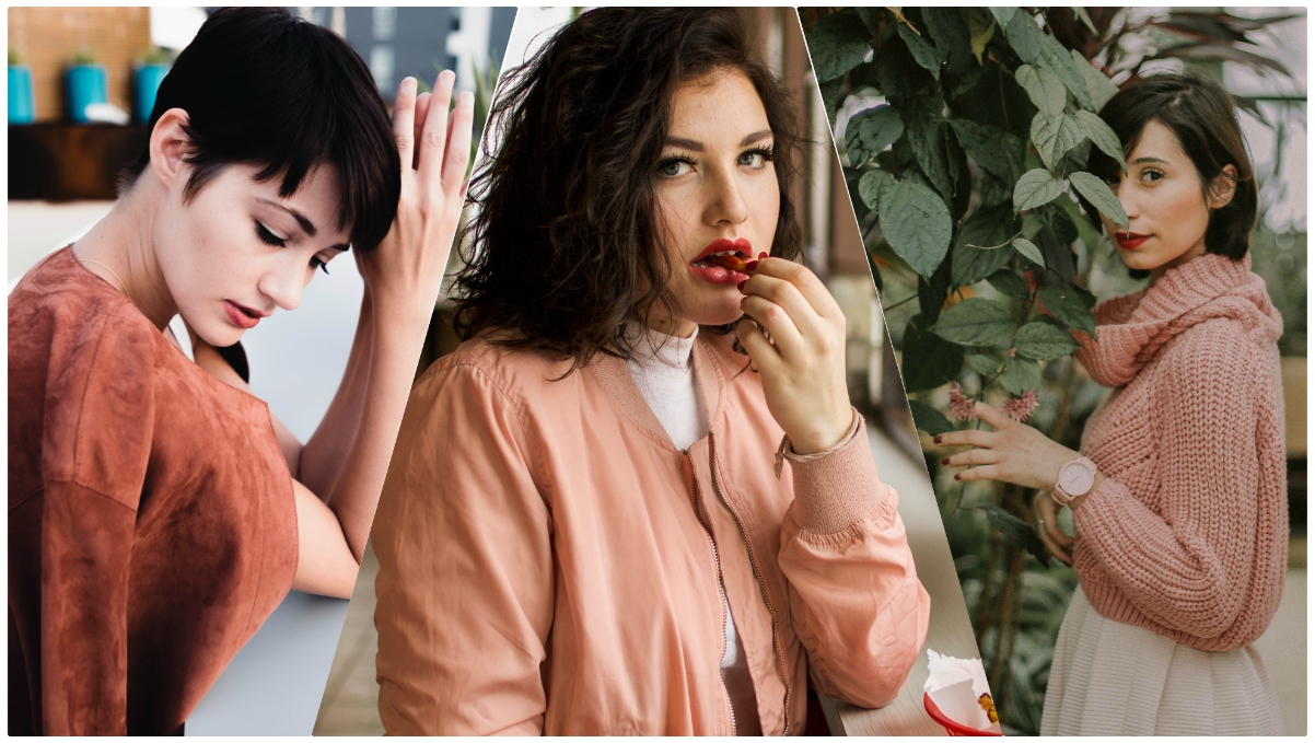
A second hue not to be left out is Almost Mauve. It's an undefined shade that borders between grey and pink, creating something so magical that you’ll be drawn to it immediately. Flowy skirts and sundresses are virtually calling out to this hue, so make sure spring doesn’t catch you short of something in this arena. Finally, Warm Sand is definitely worth mentioning as this is one of those timeless shades that will be with you season after season, and our recommendation is that you put it to use through an equally timeless trench coat.
A popping spring
Before diving into the world of spring colours, you should know that they are bold, brave and full of life, so be ready to embrace them. First in line is the ultimate attention getter – Lime Punch. There is absolutely no way of going unnoticed when wearing something in this shade, and if drawing attention to yourself excites rather than frightens you, take a cue from Tom Ford and embrace it in the form of an ultra-glamorous body-hugging dress (sequins optional). If your tastes lean towards something a touch more subdued, Meadowlark makes for a perfect alternative. Less ‘out there’ but equally stunning. Broad shoulder double-breasted blazers were simply meant for this shade.
Different shades of red were an element of Spring Fashion Month that definitely didn’t go unnoticed. However, if you feel that too much red would be overly ‘statement making’ Pantone’s vibrant pick – Cherry Tomato will go wonderfully on a new pair of trousers or an amazing pencil skirt.
Palace Blue is also something we don’t want to leave in the corner. Highly reminiscent of the blues dominating the ‘80s fashion, this colour is full of life, and it will bring forth your eclectic side. Whether you go with Palace Blue patent leather pumps, a gorgeous dress or even a spring cape, you are bound to look chic and noticeable. Blooming Dahlia is a hue that will make you weep, that is how elusively gorgeous it is. The hue is powerful but romantic and gentle at the same time, and pleated midi skirts and summer dresses plus this hue is a match made in heaven.
For bringing forth a contemporary-retro vibe, Ash Rose and Nile Green are the colours for the job. These grounded muted pinks are the perfect choice for both trousers and tops, not to mention retro A-line dresses that will rein again this summer. Nile Green, on the other hand, serves as a great base to layer more ‘popping’ shades on as it’s interesting enough to be a part of an outfit, but not conspicuous enough to steal focus.
Author BIO:
Sophia Smith is Australian based fashion, beauty and lifestyle blogger. She could be described as a beauty addict and life lover. She writes mostly on fashion and beauty related topics, mainly through blogs and articles. Sophia is a regular contributor to High Style Life.
I hope you enjoyed that informative and interesting post from one of my favourite guest bloggers and fashion-in-the-know ladies, Sophia Smith.
Until next time,
xoxo


No comments:
Post a Comment
Leave me a comment! I love reading what you've got to say!